In my last post I discussed the growing volume of geodata available online – and in particular ways in which it can be accessed by freely available GIS software. This kind of accessibility has great potential for geoscientists, and among other uses (e.g. teaching, structural geology) perhaps is a step toward ‘crowdsourcing’ geotechnical expertise for geohazard identification and emergency response. We can take a look at the 2013 Mt Dixon rock avalanche to see an example of this (see Dave Petley’s landslide blog for a very interesting discussion on this event).
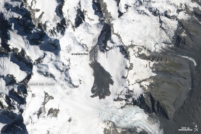
A NASA EO-1 ALI image of the Mt Dixon rock avalanche deposit (credit: The Landslide Blog)
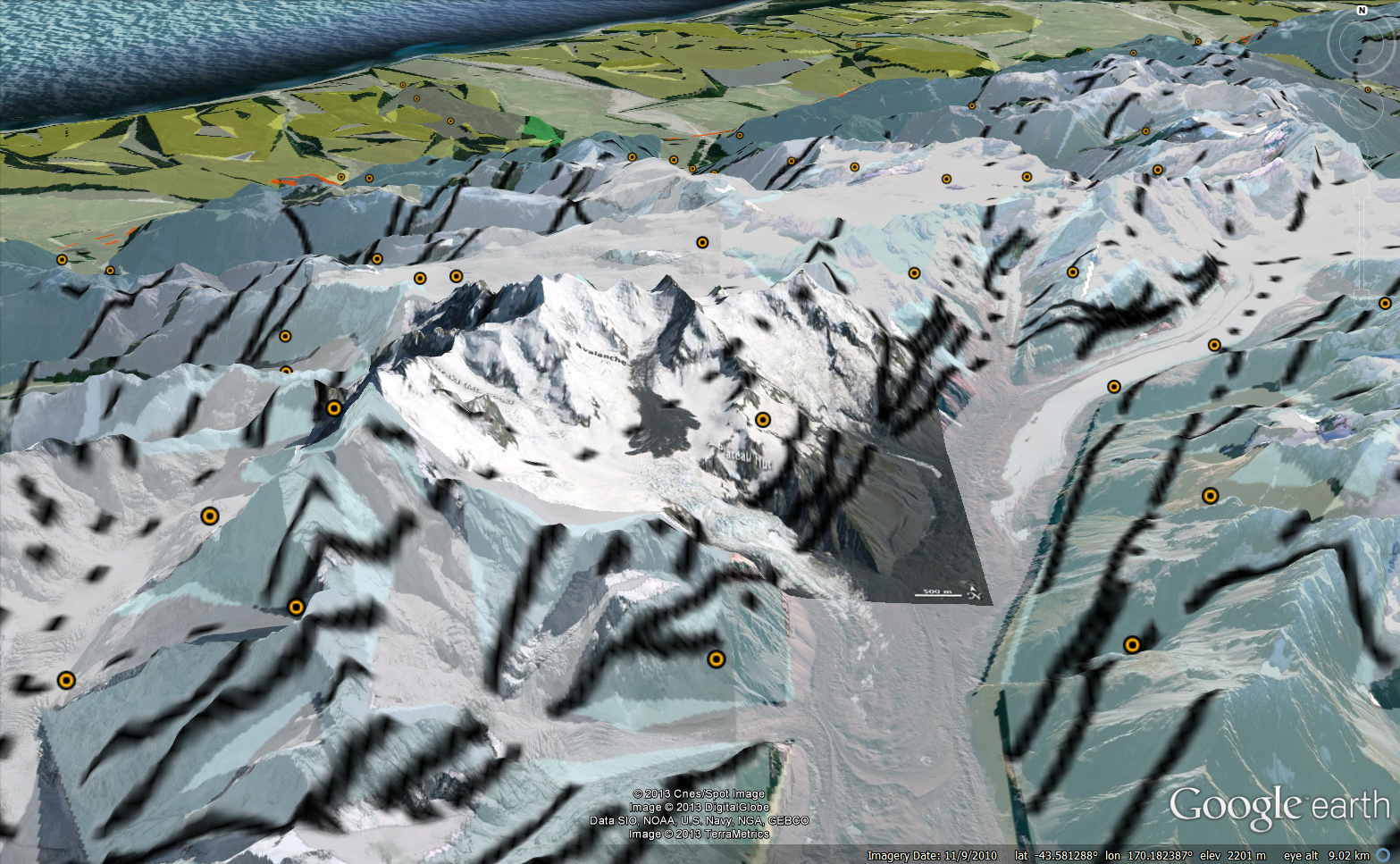
By draping the NASA image over topography in GE, and including the geological units, fault traces, and structural measurement layers from the GNS repository we can get some understanding of the lithological and structural setting of the failure.
Satellite image overlay of the rock avalanche including structural and lithological data
Click here to download the data for Google Earth
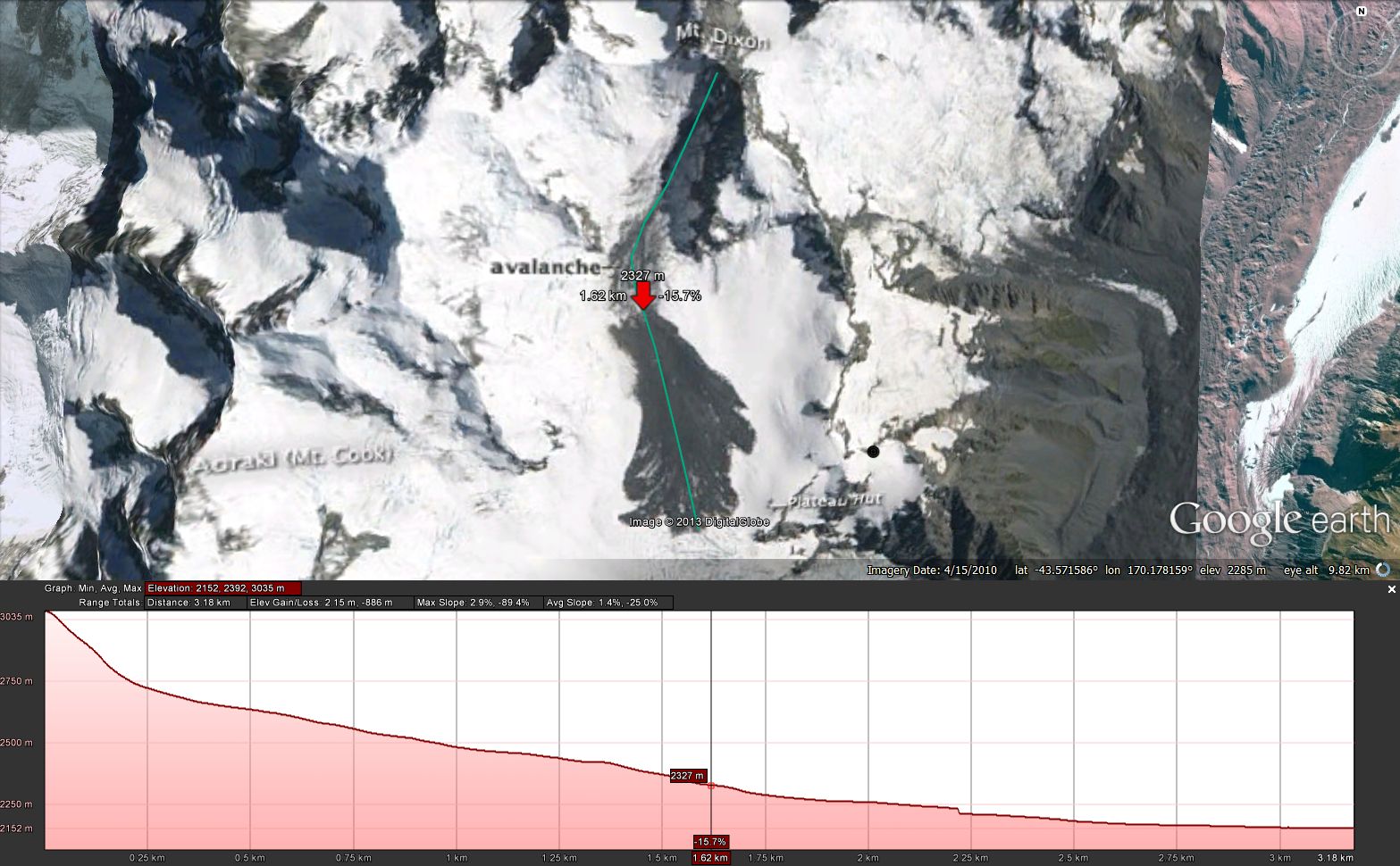
The light blue shading indicates the failure occurred in interbedded greywacke and argillite (perhaps no surprise there), and we might infer that structure in the region of the landslide is possibly affected by the westerly-dipping faults present on the lower valley wall. The orange markers indicate the location of structural measurements, and support a regional dip azimuth of between 260 and 330 deg, with an inclination of between 60 and 80 deg. This is a similar orientation to the planar rock slope immediately south-east of Mt Dixon, and would indicate the initial movement direction was perpendicular to the local bedding orientation. Using the “Add path” tool in GE, we can draw a long profile to investigate the pre-failure topography of the runout zone. If we select the new path in the menu, the “Show elevation profile” tool will produce a plot of elevation vs. distance along the path.
Mt Dixon rock avalanche runout path, indicating an elevation loss of ~890 m, and reach angle of 29% (16 deg). The red arrow on the map indicates the transition to deposition, and is reflected by the vertical grey marker on the elevation profile. This appears to be the base of a crevasse field marking a steepened section of the glacier surface.
While these observations are relatively simple, I hope they provide some inspiration to realize the potential for what is a growing volume of readily-accessible geodata, particularly when it can be incorporated in a free 3D mapping platform such as Google Earth.


Leave a Reply